


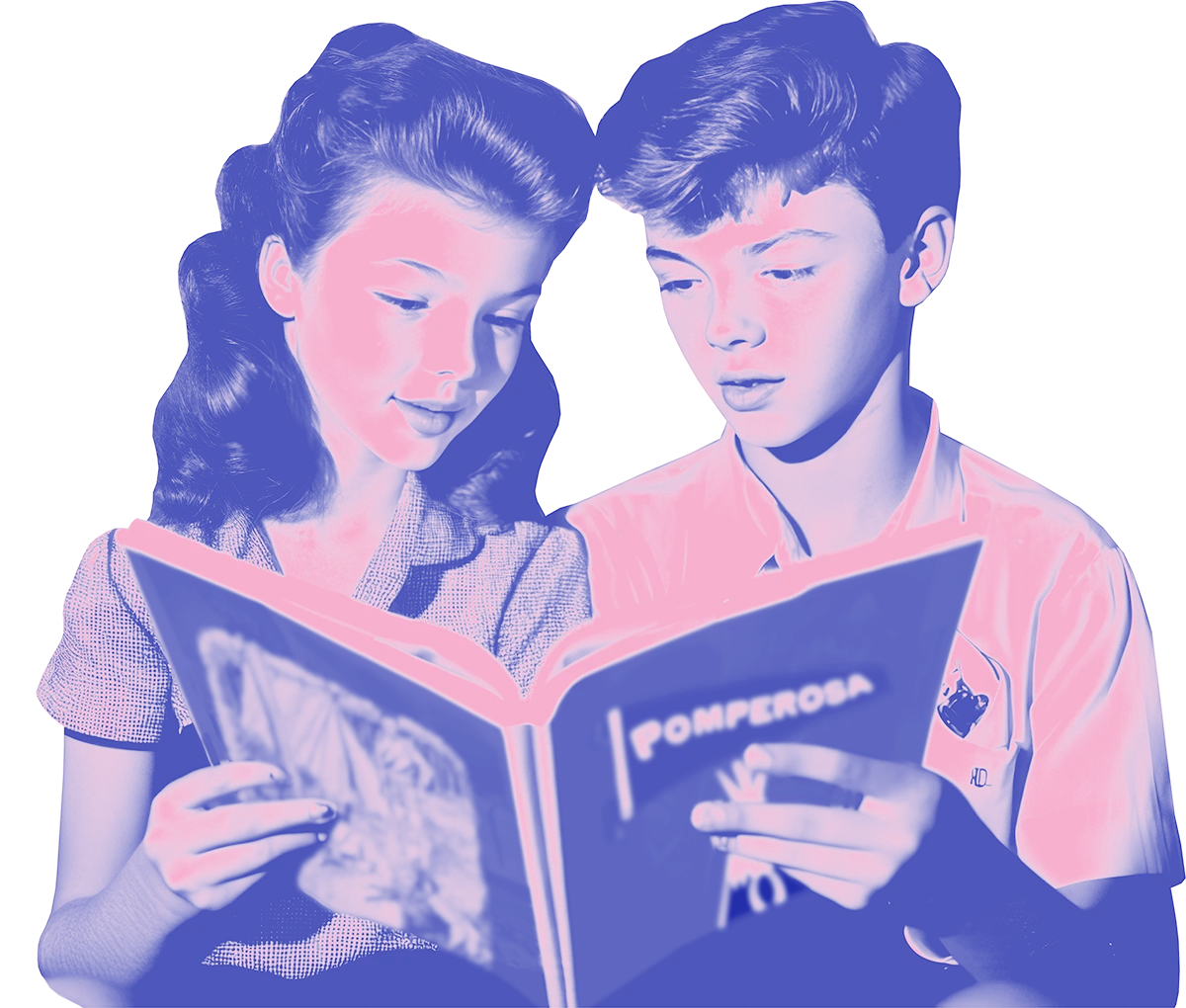

Wallpaper carries mood in a way paint rarely does. A small floral pattern can make a kitchen feel cheerful. A deep geometric can make a hallway feel dramatic. Even a quiet tone on tone print adds depth that a single paint color cannot match.
Vintage wallpaper also reflects how real homes were decorated in earlier decades. It was not just a feature wall or a quick trend. In many houses, every room had its own paper, chosen for a specific purpose. Kitchens were bright and cheerful. Bedrooms were softer. Dining rooms were often more formal. Understanding those patterns helps you choose wallpaper that feels natural rather than forced.
This guide explains the most common vintage wallpaper styles, how they were used across different decades, and where each type tends to work best in modern homes.
How Wallpaper Was Used in Real Homes
Wallpaper was once the default wall finish in many houses. Paint was available, but wallpaper added color, pattern, and texture in a single step. It also helped hide imperfections in plaster walls, which were common in older buildings.
Different rooms had different expectations. Parlors and dining rooms were meant to impress visitors, so they often featured richer patterns or scenic papers. Bedrooms were quieter, with small florals or subtle geometrics. Kitchens and bathrooms used practical patterns that could handle everyday wear.
Hallways were often the most decorative spaces in the house. Because they connected all the rooms, they were seen as an opportunity to make a visual statement. Many homes used bold or large scale wallpaper in these transitional areas.
In working class homes, wallpaper was also practical. It brightened dark rooms and covered cracked plaster. It was one of the most affordable ways to make a space feel finished and cared for.
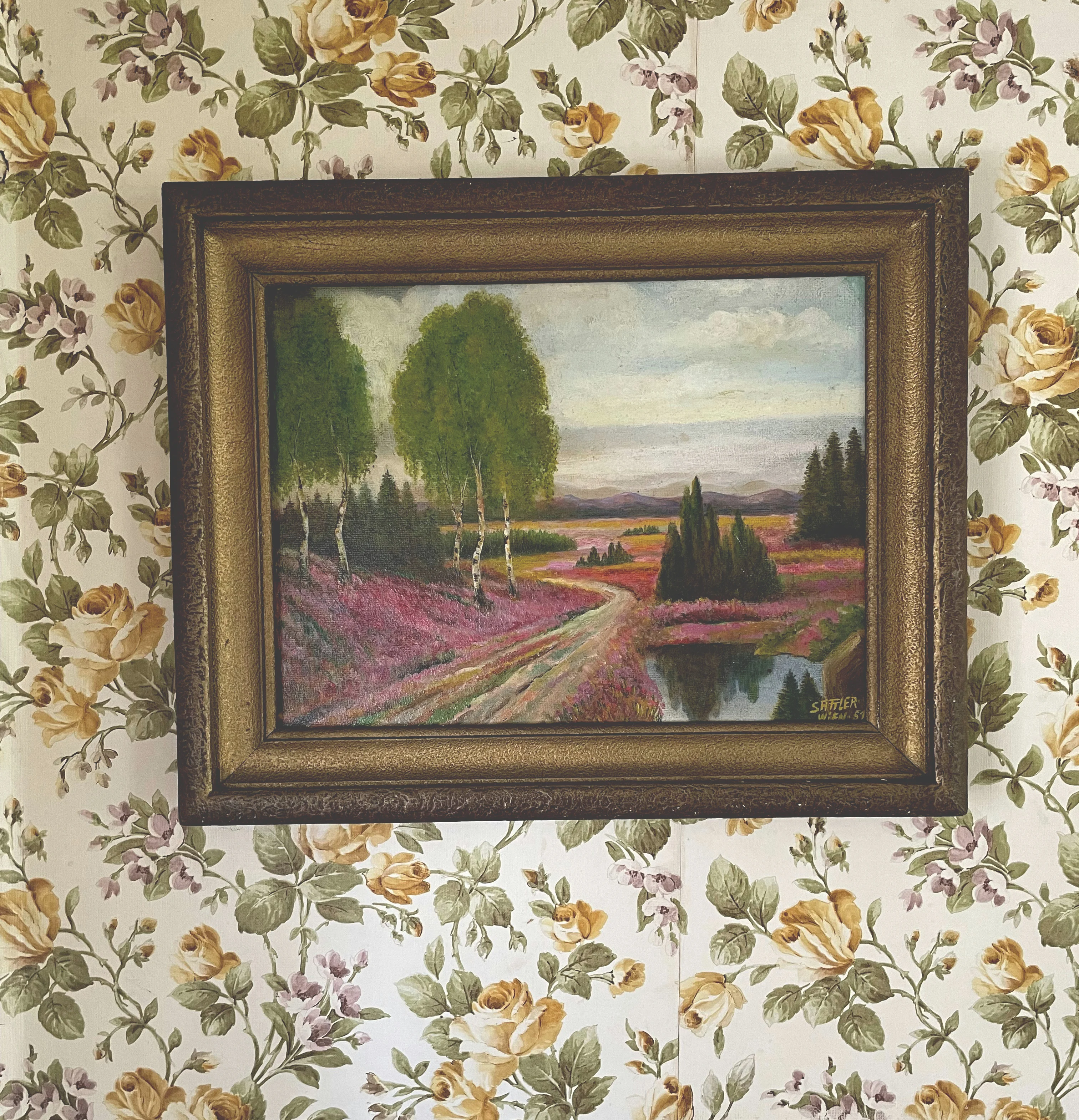
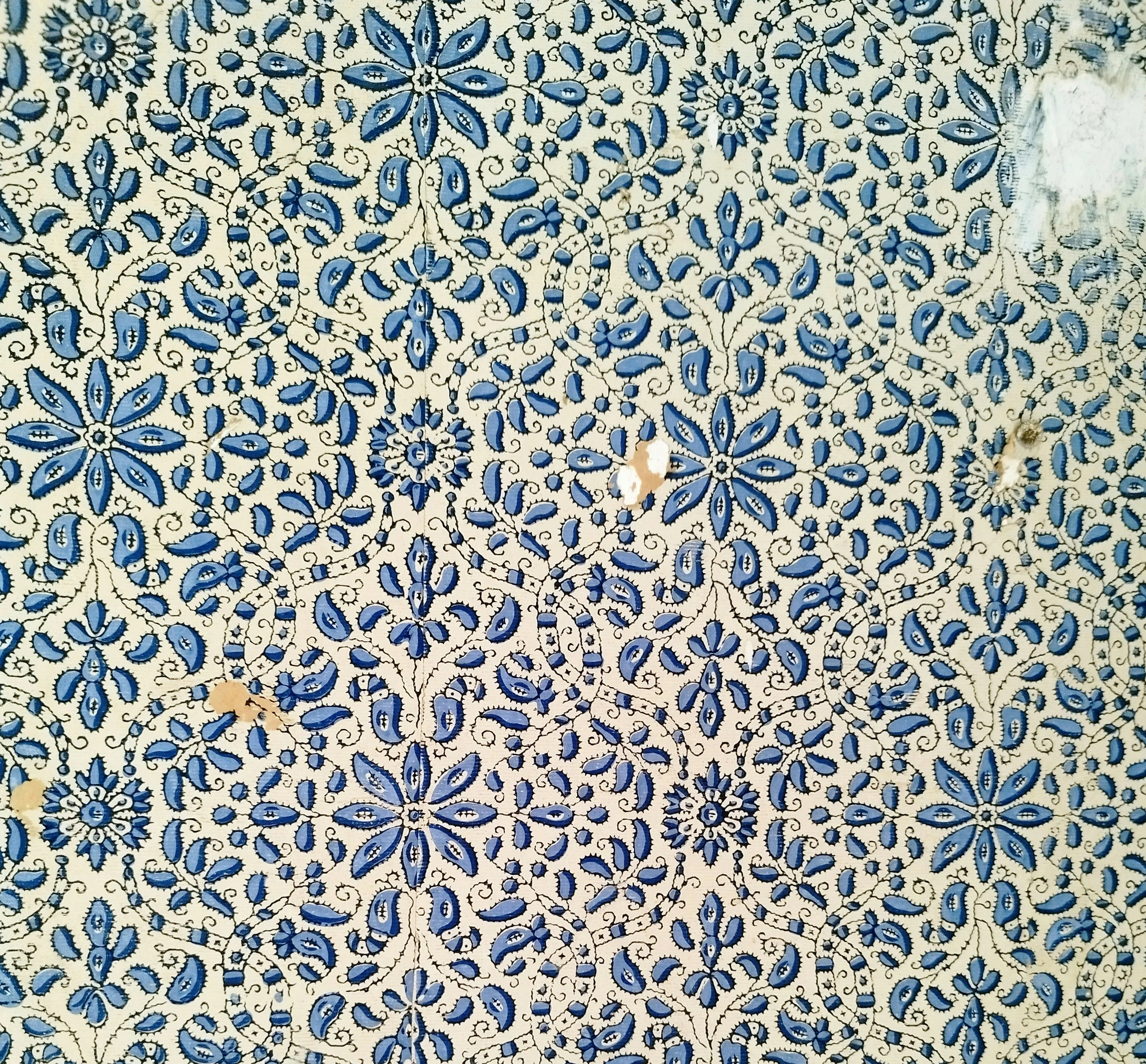
Victorian and Early Traditional Patterns
Victorian wallpaper was elaborate and layered. Homes often used a three part system on the walls, with a darker lower section, a patterned middle area, and a lighter decorative band near the ceiling. This approach created a sense of depth and formality.
Common Victorian patterns included cabbage roses, damasks, scrolling vines, and birds. Many designs were influenced by nature, though they were often stylized rather than realistic. Colors tended to be rich and deep, including burgundy, forest green, navy, and gold.
These papers were usually found in parlors, dining rooms, and formal bedrooms. They were meant to signal taste and status. Even modest homes often had at least one room with a more elaborate paper.
Today, these patterns work best in rooms where you want a sense of tradition and warmth. Dining rooms, libraries, and powder rooms are especially good candidates. A single accent wall in a Victorian style paper can add depth without overwhelming the space.
Art Deco and 1930s Geometric Papers
The 1920s and 1930s brought a major shift in wallpaper design. Instead of dense florals and scrolling vines, patterns became more geometric and streamlined. The influence of Art Deco introduced shapes like chevrons, fans, stepped lines, and stylized palm leaves.
Colors also changed. Jewel tones such as emerald, sapphire, and deep red became popular, often paired with gold or metallic accents. Some papers used black backgrounds with metallic designs for a dramatic effect.
These wallpapers were commonly used in living rooms, dining rooms, and entry areas. They created a sense of glamour and modernity, which suited the optimism of the era.
In modern homes, Art Deco style vintage wallpaper works well in smaller spaces where you want a strong visual impact. Powder rooms, entryways, and dining nooks benefit from these bold geometric designs.
1940s Papers: Modest and Practical
The 1940s were shaped by wartime austerity. Wallpaper from this period is generally quieter and more practical. Patterns tended to be small and simple, often featuring delicate florals, fruit motifs, or subtle stripes.
Colors were softer and more restrained. Mint green, pale yellow, and light blue were common. The overall effect was calm and modest rather than flashy.
These papers were used throughout the house, especially in kitchens and bedrooms. They reflected a time when practicality mattered more than decoration.
In a modern setting, 1940s style wallpaper works well in small kitchens, laundry rooms, or guest bedrooms. The gentle colors and small patterns create a comforting, nostalgic feeling.
1950s Wallpaper: Cheerful and Optimistic
The 1950s marked a major boom in wallpaper use. As new suburban homes were built, many families chose fresh wallpaper as part of the move in process. Kitchens, in particular, developed their own distinct wallpaper styles.
Popular patterns included cherries, apples, pineapples, coffee pots, roosters, and kitchen utensils. Many of these designs appeared on gingham or checkered backgrounds. The effect was cheerful and friendly, perfect for the heart of the home.
Color palettes were bright but soft. Mint green, baby pink, turquoise, butter yellow, and pale blue dominated. Some combinations were bolder, such as turquoise with orange or pink with black accents.
These wallpapers were most common in kitchens, breakfast nooks, and sometimes bathrooms. They were meant to feel welcoming and easy to live with.
Today, 1950s style vintage wallpaper works best in kitchens, small bathrooms, and laundry areas. A single wall in a fruit or atomic pattern can bring personality to an otherwise simple space.
1960s Mod and Pop Influences
Wallpaper in the 1960s became more expressive. Pop Art, youth culture, and modern design all influenced patterns. Geometric shapes grew larger and more abstract. Color blocking and high contrast combinations became common.
Bright colors dominated many designs. Orange, lime green, hot pink, and electric blue appeared in bold combinations. Some papers used optical illusions or repeating abstract shapes to create movement on the wall.
These wallpapers appeared in living rooms, bedrooms, and even kitchens. They reflected a new sense of freedom and experimentation in home design.
In modern homes, 1960s style vintage wallpaper works well in creative spaces. A home office, reading nook, or small living room corner can handle a bold mod pattern without feeling overwhelming.
1970s Wallpaper: Warm and Maximal
The 1970s marked the peak of wallpaper’s popularity. Patterns became larger, warmer, and more expressive. Oversized florals, bold geometrics, and textured finishes were everywhere.
Color palettes shifted toward earth tones. Avocado green, harvest gold, burnt orange, rust, mustard, and chocolate brown defined the decade. These colors reflected a desire for warmth and comfort.
Textured papers also became popular. Flocked wallpapers had a raised, velvety surface. Foil papers reflected light with metallic finishes. Grasscloth added natural woven texture.
These wallpapers were used in living rooms, dens, and bedrooms. Many homes from this era had at least one room covered in a large scale floral or geometric pattern.
In modern interiors, 1970s style vintage wallpaper works best in cozy spaces. Dens, reading rooms, and bedrooms benefit from these warm tones and large patterns.
Kitchen Wallpaper Traditions
Kitchens developed their own wallpaper language across the decades. These rooms were meant to feel clean, cheerful, and easy to maintain.
In the early twentieth century, kitchens often used simple, washable papers in light colors. By the 1940s and 1950s, novelty patterns became the norm. Fruits, roosters, teacups, and kitchen tools were common themes.
These patterns were usually small and repeated evenly across the wall. They created a lively background without overwhelming the room.
Today, kitchen wallpaper works best on a single wall, above a chair rail, or in a breakfast nook. Smaller patterns feel more authentic to the way these papers were originally used.
Bathroom and Hallway Papers
Bathrooms often used smaller scale patterns in lighter colors. Florals, dots, and simple geometrics were common. The goal was to keep the space feeling fresh and clean.
Some mid century bathrooms used bold patterns in pastel tones. Pink and gray combinations were especially popular in the 1950s.
Hallways, on the other hand, were often more dramatic. Because they were transitional spaces, homeowners felt comfortable using bolder patterns there. Large florals, geometrics, and textured papers were common choices.
In modern homes, hallways remain one of the best places for strong wallpaper. A bold pattern in a narrow corridor can feel intentional rather than overwhelming.
Choosing Vintage Wallpaper for Modern Spaces
The most important factor when choosing vintage wallpaper is scale. Large patterns need room to breathe. Small rooms often look better with smaller, more repetitive designs.
Color also matters. Vintage papers tend to use softer, more complex colors than many modern prints. Choosing a palette that echoes the rest of your furnishings helps the wallpaper feel integrated.
It also helps to think about the room’s function. Kitchens and bathrooms usually benefit from lighter, more cheerful patterns. Living rooms and bedrooms can handle deeper colors and larger designs.
If you are unsure, start with one wall or a small space. Powder rooms, entryways, and breakfast nooks are ideal testing grounds for vintage wallpaper.
How to Mix Wallpaper with Modern Furnishings
Vintage wallpaper does not require a fully vintage room. In many cases, the contrast between an old pattern and modern furniture creates the most interesting result.
A mid century geometric wallpaper can look striking behind a simple contemporary sofa. A soft floral can warm up a modern kitchen with clean cabinetry.
The key is balance. If the wallpaper is busy, keep the furniture simple. If the wallpaper is subtle, you can add more texture and color through furnishings.
Pattern as Memory
Vintage wallpaper carries the memory of how homes once felt. Each pattern reflects a particular era, a particular mood, and a particular way of living. Kitchens were cheerful, bedrooms were calm, and hallways were often the boldest spaces in the house.
Choosing vintage wallpaper today is less about recreating a perfect period room and more about adding depth and personality. A single patterned wall can change the atmosphere of a space.
In many homes, the most comfortable rooms are the ones that show a bit of history. A soft floral, a cheerful kitchen print, or a warm geometric pattern can make a room feel settled, as though it has been part of the house for years.